How to add Call-to-Action Buttons to your Facebook Page posts
Apr 9th, 2016 Mr., Howto, Facebook, Announcement
Increase your click-through rate by adding Call-to-Action (CTA) buttons to your Page links.
What are Call-to-Action buttons for Links
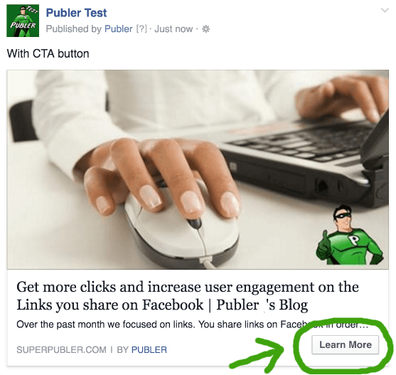
Call-to-Action buttons on Page links, are a call for your viewer to take a certain action. It could be anything from a call to visit your website, make a purchase, or anything in between. They will show up on the bottom right corner of the link attachment in the language the viewer is using, as shown below.

It basically tells the viewer what to expect when clicking the link, thus a great incentive for doing so. Whether you are selling auto parts, encouraging app installs or driving brand awareness, there's a CTA that fits your objectives.
How to add Call-to-Action buttons on Links
First, you can only add them using Publer. Facebook does not let you add CTA buttons to links from their website, unless you create an ad. Also keep in mind that CTA buttons work only for links posted to Facebook Pages. So if you're posting/scheduling a Link to your Profile, Group or Event, don't bother adding a CTA. You can, but it will be ignored by Facebook and viewers won't be able to see it.
There are 20 CTA buttons you can choose from. Yes, a lot. Here's how you can add a CTA button to a link you're sharing using Publer. After you have attached the link, you will be able to select any of the 20 CTA buttons (bottom right corner of the link preview). By default the No Button option is selected. To make it easier on you, we have grouped these CTA buttons into 5 categories. So let's suppose the link you're sharing is a news article, or in our case a blog post. It makes sense to use the Learn More, Watch More or even Watch Video if the article contains a video.
P.S. Don't add a CTA button if you're sharing a GIF. It will break it and it won't be playable when viewed on Facebook.
Even though these CTA buttons have different names, their function is the same: they take the user to the website you shared, except for the Send Message and Call Now button which we will now cover in more details.
The Send Message button
Instead of taking the user to the link you shared, this CTA button will let the user send a message to the Page that shared the link. See it action below.
This is perfect if you're posting something that you think users might want to contact you for more info. The user can visit the link you shared and then go back and contact you with just a button click. It will work regardless if the user is on mobile or on a computer.
The Call Now button
Instead of taking the user to the link you shared, this CTA button will let the user dial the telephone number you provide in advance. If you select the "Call Now" option, another field will pop up where you can enter the telephone number you want to be called at. Keep in mind that your telephone number must start with the country code (i.e. 001 or +1 for U.S.A.), followed by the area code. Check out the following example.
This is perfect if you're trying to sell a product on your site. See how the CTA button behaves when it's clicked on mobile (left) and from a computer (right)
The user can also click the link you shared. He can then go back and call you right away. If he's dialing from a computer, he will be asked to use any of the apps that lets you make phone calls (Skype, FaceTime etc)
Are Call-to-Action buttons important
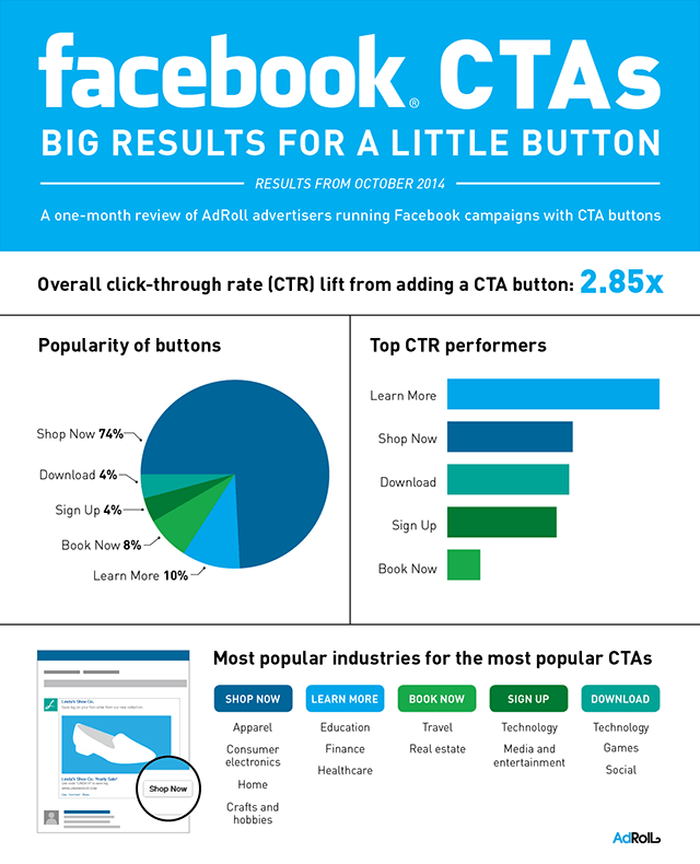
Adding a CTA button to your Page post is optional, but we highly recommend it. According to AdRoll, you increase your overall click-through rate (CTR) 2.85 times simply by adding a CTA button. Big results for a little button.

Any kind of message — email, blog, singing telegram —is more effective when it tells the person who gets it exactly how to respond. On Facebook, a clear call to action (CTA) lets the audience know exactly what to expect when they click, as well as what your brand has to offer. Your website can have great content, design and features, but if there is no clear call to action, you can lose the user’s interest. Your visitors will need to know what to do.
Let us know in the comments how these call-to-action buttons are working for you.